Wednesday, 27 April 2016
Tuesday, 19 April 2016
Tuesday, 5 April 2016
Question 5 - Audience Feedback
To get an appropriate feedback, I concluded my 6 questions on a website called "www.monkeysurvey.com" and asked 13 people to complete my survey as I needed feedback on produced magazine. The results seems to be quite accurate. I have asked people who resemble my target audience by age (teens to young adults) with 3 people who are over 18 and the rest who are under 18 to fill out my survey through Facebook by sending them the link to my
questions (https://www.surveymonkey.co.uk/r/SVPRY9H)
Above these questions was an image of my front cover, for the first question, I have asked people if it looks like a music magazine as it can somehow appear like a magazine of a different genre to another person. The results for this particular question was positive - 92.31% of people said that it looks like a music magazine whereas 7.69% said it doesn't. The reason why it might not look like a music magazine is because the model doesn't look like an artist or musician and no instrumental symbols are used in the front cover.
 My next question was "What genre do you think it is?" the majority said that it was Dubstep meaning that the magazine successfully appeals to my desired target audience, however some answered that my magazine is a Jazz and a Pop magazine. To increase the percentage for ''Dubstep'' I should have made it more clear like adding a darker colour theme such as black and neon as those colours associate with the dubstep genre. However, Chillstep resembles closely with Dubstep and Pop, meaning that the percentage of people thinking it's a pop magazine could also be my target audience although one person skipped this question meaning that only 12 answered.
My third question was "Is my magazine eye-catching?" This particular question also has positive responses as 92% of people agree with my question and believe that it would easily catch their attention. Not everyone believed it was eye-catching enough so in order to make it more eye catching I would have to improve my colour theme by making it brighter and busier. I could also make it more eye-catching by enlarging the puffs as they might not be as visible as I initially thought.
I asked another question which was "Do you think my magazine is successful?" and 12/13 people thought that my design was successful whilst one person wasn't sure about how successful it was.On the other hand, no people said that my design was unsuccessful which means that I managed to make it appealing enough to my target audience.
For this question, only 12 people answered as one person have skipped this question. I asked people "What do you like most about the design?" to find out what they think is successful about my design in particular. Majority believed that they liked the image following by 3 people who liked the masthead and 2 people who liked the graphics and the title. One person commented that they like the layout. This suggests that my target audience would find my magazine quite appealing in many different ways. As the Image turned out to be most successful, I could improve it by making it more engaging.
Finally, my last question was about fashion. I wanted to know if my model looked fashionable in my target audience's eyes as I researched trends and the 'hipster' style to relate more to my readers. Fortunately, 11/13 people believed that my model was fashionable whilst other two people were either not sure or thought she wasn't trendy enough. In order to improve this, I could make it more obvious that I was aiming for a hipster style by adding a beanie hat, headphones, black lipstick and a different coat.
questions (https://www.surveymonkey.co.uk/r/SVPRY9H)
Above these questions was an image of my front cover, for the first question, I have asked people if it looks like a music magazine as it can somehow appear like a magazine of a different genre to another person. The results for this particular question was positive - 92.31% of people said that it looks like a music magazine whereas 7.69% said it doesn't. The reason why it might not look like a music magazine is because the model doesn't look like an artist or musician and no instrumental symbols are used in the front cover.
 My next question was "What genre do you think it is?" the majority said that it was Dubstep meaning that the magazine successfully appeals to my desired target audience, however some answered that my magazine is a Jazz and a Pop magazine. To increase the percentage for ''Dubstep'' I should have made it more clear like adding a darker colour theme such as black and neon as those colours associate with the dubstep genre. However, Chillstep resembles closely with Dubstep and Pop, meaning that the percentage of people thinking it's a pop magazine could also be my target audience although one person skipped this question meaning that only 12 answered.
My third question was "Is my magazine eye-catching?" This particular question also has positive responses as 92% of people agree with my question and believe that it would easily catch their attention. Not everyone believed it was eye-catching enough so in order to make it more eye catching I would have to improve my colour theme by making it brighter and busier. I could also make it more eye-catching by enlarging the puffs as they might not be as visible as I initially thought.
I asked another question which was "Do you think my magazine is successful?" and 12/13 people thought that my design was successful whilst one person wasn't sure about how successful it was.On the other hand, no people said that my design was unsuccessful which means that I managed to make it appealing enough to my target audience.
For this question, only 12 people answered as one person have skipped this question. I asked people "What do you like most about the design?" to find out what they think is successful about my design in particular. Majority believed that they liked the image following by 3 people who liked the masthead and 2 people who liked the graphics and the title. One person commented that they like the layout. This suggests that my target audience would find my magazine quite appealing in many different ways. As the Image turned out to be most successful, I could improve it by making it more engaging.
Finally, my last question was about fashion. I wanted to know if my model looked fashionable in my target audience's eyes as I researched trends and the 'hipster' style to relate more to my readers. Fortunately, 11/13 people believed that my model was fashionable whilst other two people were either not sure or thought she wasn't trendy enough. In order to improve this, I could make it more obvious that I was aiming for a hipster style by adding a beanie hat, headphones, black lipstick and a different coat.
Saturday, 2 April 2016
Evaluation Question 5 - Attracting Target Audience And Choices Made In Production.
Question 5 - Created with Haiku Deck, presentation software that inspires;

My initial design and my final product ended up looking fairly similar in terms of layout and design. Additionally, I changed the colour scheme, text, model's pose and the graphics which improved the overall look of my magazine. I already decided on my model's costume, therefore I had it on my front cover plan.
 I researched few magazines and Dub-step art and textures to help with the production of my magazine. I found out that dub step has a lot of neon colours such as turquoise and yellow and a lot of dark colours such as ocean blue and black. I decided I'm not going to use black because it isn't very eye-caching and makes the magazine look plain and un-professional. Therefore, I used ocean blue. A big amount of Dub-step art is extremely colourful and 'artificial' which matches well with it's music style, however chill-step is more natural and calming so I decided that I am not going to use too many colours but instead, use a stricter colour scheme so it's not too busy and it's not too plain and keep it busy and engaging for the readers yet at the same time match with the genre.
In my original plan, There wasn't many things overlapping the masthead as I thought by not overlapping it, it looks more professional, However, I found out that most magazines such as Rock Sound, Rolling Stones and Kerrang cover up their Mastheads with graphics and the Model, so I decided to do the same because by overlapping the text, it creates a a 3D effect which makes it stand out and at the same time, makes the model 'pop out' of the magazine.

 A lot of music magazines portray their models on the front page as simple and emotionless (usually wearing plain colours and simple clothing such as a grey T-shirts and black trousers).However, this is not the case with fashion magazines as they usually make their models very colourful, engaging and at the same time make their models perform some unusual poses. I wanted my magazine to be engaging therefore it was influenced by fashion magazines and a music magazine called Mixmag magazine. I wanted my magazine to have a happy mood, therefore I made sure my model appears unique compared to the plain magazines and I also made it colourful to match with the mood I was trying to convey.
 The title was a major production change, I made it bigger, changed the position of it and I also changed the colour as it originally was a lighter shade of blue. For the title, I added some graphics such as the scratch and the windmill on a letter ''L'' to make it really stand out from other text within the front cover. I have noticed that it is common in dubstep magazines to have titles that stand out, one example for this is Rocksound magazine with the issue that featured Skrillex in their front cover. Rocksound magazine also has a graphic splash on the title on the letter ''L'' as well which makes it look more interesting than other texts and titles from other magazines.
There was another thing I had to keep in mind, which was how my model was dressed. I needed to know what clothes are in style so my target audience would relate to the model and buy the magazine. This is the reason why I dressed up my model in a fashionable outfit.
Monday, 21 March 2016
Question 4
The image above is a visual representation of my target audience for my final product.
At the beginning of my research, I looked into different existing magazines such as Rock Sound and Mixmag to find out more about their target audience and I discovered that majority of their audience are male and are also young (they are aged between 18 and 25). This is because this type of music is quite modern and audience like to visit places such as gigs, concerts and clubs and more males enjoy this type of music because this genre is known for disliking authority and the need to be unique, this genre is also considered 'hardcore'.
To make sure this research is accurate, I made a questionnaire and found out that there are slightly more males than females but there isn't a big difference as a 45% of my audience are female, therefore I decided to make my magazine appealing to both genders equally. For example, using gender neutral colours and design as well as using a non-provocative female model.
Friday, 18 March 2016
Question 3 Magazine Distributor
Wednesday, 9 March 2016
Question 3
This Prezi explains the stages of production and goes through Publishing and Marketing of the magazine.
A distributor is an individual or a business that purchases non competing products, warehouses them and resells them either to the consumer itself or to another individual that will sell these goods to the costumer, in other words a retailer. In this case, a distributor will try to promote the magazine so it keeps high in demand in order for the product to be sold at a shop or a market. The distributors not only can support in promotion and demand of the magazine but also provide a range of goods and services such as product information, credit, after-sales services and technical support to their customers. In order to make it legal for the distributor to sell third parties, they must have a clear contact and licensing deals such as documents stating that the distributor itself isn't profiting illegally or things such as copyright contracts. There are other factors a distributor and a magazine owner need to agree on such as the amount of time the distributor will promote the product and providing the magazine owner with regular accounting statements.
However, a distributor can be quite expensive because the distributor fees are deducted from Net process suggesting that the profit from sales has been marketed. This means that a certain percentage of the profit coming from the sales of the magazine copies will be used for promoting and advertising the magazine. Distributors need to decide at what location they need to catch the audience's attention picking the most suitable place for the magazine. For example, they need to consider the age, gender and what places the readers would go on a regular basis.
Thursday, 3 March 2016
Monday, 22 February 2016
Wednesday, 10 February 2016
Production Diary Double Spread
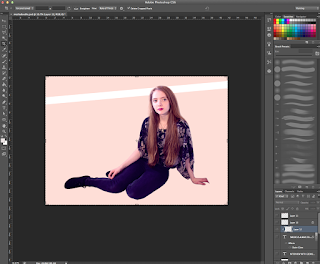
 Firstly, I cut out the model from the original image using the selection tool and placed her on a double page spread sized canvas, I painted the layer below the model into a creamy colour. I also added a white line going from the first to the second page which is used for the title.
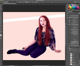
Then, I photoshopped the model so she looks more like the one in the cover by painting her hair red. I decided to make her more gothic in the double spread because it matches more with her outfit and the term 'Mysterious'. I also added eyelashes that were obtained from google images.
Going back to the background layer I used a soft brush tool and pressed on a red colour. I clicked on the edge of the white bar and pressed shift, clicked on the other edge to make a straight line and converted the layer setting from 'Normal' to 'Overlay'. Then I adjusted the opacity of the red glow to decide how vibrant I want it to be.
On the upper left hand side, I started writing a quote and the title. I also googled for a glass PNG in google images and placed it in a desired location. I selected the inside of the glass using the magic wand tool and inverted the selection, made a new layer and coloured it in red, set it to overlay and adjusted opacity. Then, I converted the quote text layer into a normal layer, made another new layer, set it to clipping mask and painted the quote in a lighter colour to give the glass dimension. Finally, I double clicked on a quote layer and selected ''stroke'' to make the white outline.
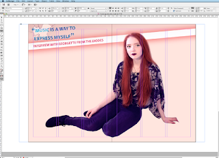 I saved the Photoshop file as a JPG and opened Adobe InDesign CS6 and added the image onto the program. Then, I created 6 columns to place the text I was planning to write. Within the columns, I placed 3 text boxes and linked them with each other to continue the text once the space of the text box is finished.
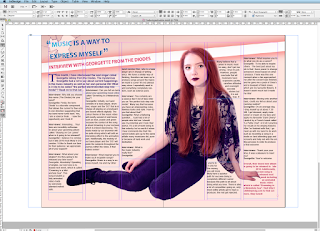
I added some text on the first page and left some space for introduction.
I added 3 more text boxes on the other sheet, linked them and also outlined the model with a tool that wraps an image around the model. Finally, I added page numbers at the bottom of the double spread.
Monday, 8 February 2016
Production Diary Contents Page
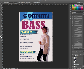
I laid out my plan roughly and started adding detail such as the contents, model etc. I cropped out the model of her original image by using a selection tool and an eraser for smooth edges, then I double clicked on the model's layer and added a shadow. I also added fake eyelashes (taken from google images as a PDF) and tweaked up the colour. I used the same font for my Contents to match with my cover and tried to stick with my colour theme. I also laid out a shadow on the Contents box.
I've decided to make the 'bass' bigger because I wanted the model to be overlapping something. I also wanted the 'Bass' to 'pop out' of the contents page to show what Chill-step genre is all about and to fill in the empty space. I started adding in text, mostly the content's titles which are written in bold.
Here, I decided that the 'Bass' part needed a texture to make it look more interesting and less plain, I googled ''Dub-step texture'" and found a photograph I liked, copied it onto a new layer which was set on 'clipping group'. I also set the texture layer to 'Multiply' above the 'BASS' layer.
I started adding in writing below the bold letters in 'Features'. I also added a photograph of a bass guitar next to the 'BASS' to fill in empty space.
Finally, I added numbers that are leading to the pages of the magazine.
Production Diary Front Page
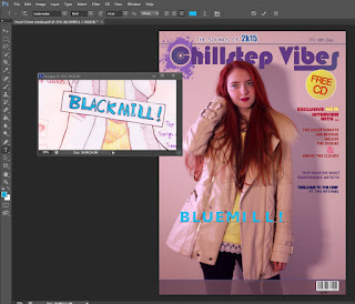 Firstly, I photoshopped the model. I made her hair red by making new layers, setting it on 'Overlay' and 'Multiply' and selecting a brush tool. Her hair was painted with a tablet pen (Wacom Intuos) which was only used for comfort purposes, it also saved me time. Then, I removed blemishes using the stamping tool and added my title in my desired font, the logo was mostly self made using brushes and internet PNG's. I googled "Splash" in google images and saved it as a PNG, opened it in photoshop and selected 'Edit', 'Define Brush Preset' to convert the image into a brush which I could use for my logo. I also made the background a different colour by electing Adjustments -> Colour Balance that only require me to move sliders.
 I have used my sketch as reference for my front cover as seen in the screen shot. I wanted to make the title big and bold whilst maintaining the eye-catching puff which is layered on top of my masthead. During this period I was choosing and reconsidering the colour theme wisely because I didn't want to make it appear too girly or too un-coordinated. I have also added a barcode I made from a barcode generator online to avoid copyright and saving the barcode as an image to use on my cover. I also added text on the right hand side corner.
At this point, I decided to change the font of my title and make it more interesting, I had problems with making this magazine gender neutral since it appeared too 'girly' due to the colour scheme, model and the font. Therefore I decided to change my colour scheme.
Finally, I added more text and featuring band names to attract more people and also added an issue number. I also added a windmill on my title's letter 'L' in order to make it more interesting. I got the windmill from Google images and also converted it into a brush.
Monday, 25 January 2016
Subscribe to:
Comments (Atom)


