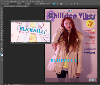
 Firstly, I photoshopped the model. I made her hair red by making new layers, setting it on 'Overlay' and 'Multiply' and selecting a brush tool. Her hair was painted with a tablet pen (Wacom Intuos) which was only used for comfort purposes, it also saved me time. Then, I removed blemishes using the stamping tool and added my title in my desired font, the logo was mostly self made using brushes and internet PNG's. I googled "Splash" in google images and saved it as a PNG, opened it in photoshop and selected 'Edit', 'Define Brush Preset' to convert the image into a brush which I could use for my logo. I also made the background a different colour by electing Adjustments -> Colour Balance that only require me to move sliders.
 I have used my sketch as reference for my front cover as seen in the screen shot. I wanted to make the title big and bold whilst maintaining the eye-catching puff which is layered on top of my masthead. During this period I was choosing and reconsidering the colour theme wisely because I didn't want to make it appear too girly or too un-coordinated. I have also added a barcode I made from a barcode generator online to avoid copyright and saving the barcode as an image to use on my cover. I also added text on the right hand side corner.
At this point, I decided to change the font of my title and make it more interesting, I had problems with making this magazine gender neutral since it appeared too 'girly' due to the colour scheme, model and the font. Therefore I decided to change my colour scheme.
Finally, I added more text and featuring band names to attract more people and also added an issue number. I also added a windmill on my title's letter 'L' in order to make it more interesting. I got the windmill from Google images and also converted it into a brush.


No comments:
Post a Comment