Monday, 22 February 2016
Wednesday, 10 February 2016
Production Diary Double Spread
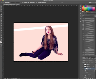
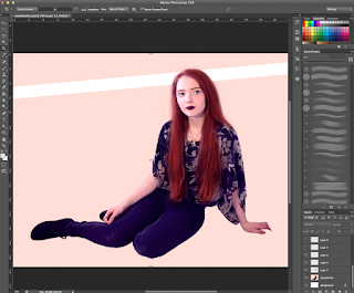 Firstly, I cut out the model from the original image using the selection tool and placed her on a double page spread sized canvas, I painted the layer below the model into a creamy colour. I also added a white line going from the first to the second page which is used for the title.
Then, I photoshopped the model so she looks more like the one in the cover by painting her hair red. I decided to make her more gothic in the double spread because it matches more with her outfit and the term 'Mysterious'. I also added eyelashes that were obtained from google images.
Going back to the background layer I used a soft brush tool and pressed on a red colour. I clicked on the edge of the white bar and pressed shift, clicked on the other edge to make a straight line and converted the layer setting from 'Normal' to 'Overlay'. Then I adjusted the opacity of the red glow to decide how vibrant I want it to be.
On the upper left hand side, I started writing a quote and the title. I also googled for a glass PNG in google images and placed it in a desired location. I selected the inside of the glass using the magic wand tool and inverted the selection, made a new layer and coloured it in red, set it to overlay and adjusted opacity. Then, I converted the quote text layer into a normal layer, made another new layer, set it to clipping mask and painted the quote in a lighter colour to give the glass dimension. Finally, I double clicked on a quote layer and selected ''stroke'' to make the white outline.
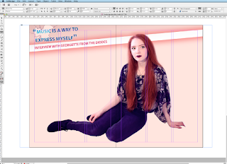 I saved the Photoshop file as a JPG and opened Adobe InDesign CS6 and added the image onto the program. Then, I created 6 columns to place the text I was planning to write. Within the columns, I placed 3 text boxes and linked them with each other to continue the text once the space of the text box is finished.
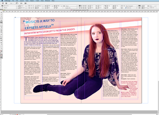
I added some text on the first page and left some space for introduction.
I added 3 more text boxes on the other sheet, linked them and also outlined the model with a tool that wraps an image around the model. Finally, I added page numbers at the bottom of the double spread.
Monday, 8 February 2016
Production Diary Contents Page
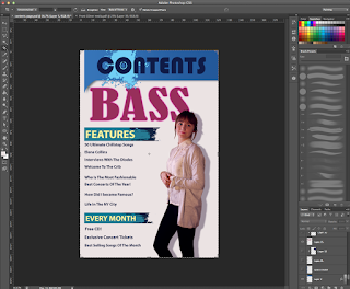
I laid out my plan roughly and started adding detail such as the contents, model etc. I cropped out the model of her original image by using a selection tool and an eraser for smooth edges, then I double clicked on the model's layer and added a shadow. I also added fake eyelashes (taken from google images as a PDF) and tweaked up the colour. I used the same font for my Contents to match with my cover and tried to stick with my colour theme. I also laid out a shadow on the Contents box.
I've decided to make the 'bass' bigger because I wanted the model to be overlapping something. I also wanted the 'Bass' to 'pop out' of the contents page to show what Chill-step genre is all about and to fill in the empty space. I started adding in text, mostly the content's titles which are written in bold.
Here, I decided that the 'Bass' part needed a texture to make it look more interesting and less plain, I googled ''Dub-step texture'" and found a photograph I liked, copied it onto a new layer which was set on 'clipping group'. I also set the texture layer to 'Multiply' above the 'BASS' layer.
I started adding in writing below the bold letters in 'Features'. I also added a photograph of a bass guitar next to the 'BASS' to fill in empty space.
Finally, I added numbers that are leading to the pages of the magazine.
Production Diary Front Page
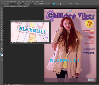 Firstly, I photoshopped the model. I made her hair red by making new layers, setting it on 'Overlay' and 'Multiply' and selecting a brush tool. Her hair was painted with a tablet pen (Wacom Intuos) which was only used for comfort purposes, it also saved me time. Then, I removed blemishes using the stamping tool and added my title in my desired font, the logo was mostly self made using brushes and internet PNG's. I googled "Splash" in google images and saved it as a PNG, opened it in photoshop and selected 'Edit', 'Define Brush Preset' to convert the image into a brush which I could use for my logo. I also made the background a different colour by electing Adjustments -> Colour Balance that only require me to move sliders.
 I have used my sketch as reference for my front cover as seen in the screen shot. I wanted to make the title big and bold whilst maintaining the eye-catching puff which is layered on top of my masthead. During this period I was choosing and reconsidering the colour theme wisely because I didn't want to make it appear too girly or too un-coordinated. I have also added a barcode I made from a barcode generator online to avoid copyright and saving the barcode as an image to use on my cover. I also added text on the right hand side corner.
At this point, I decided to change the font of my title and make it more interesting, I had problems with making this magazine gender neutral since it appeared too 'girly' due to the colour scheme, model and the font. Therefore I decided to change my colour scheme.
Finally, I added more text and featuring band names to attract more people and also added an issue number. I also added a windmill on my title's letter 'L' in order to make it more interesting. I got the windmill from Google images and also converted it into a brush.
Subscribe to:
Posts (Atom)


